

La muse inspiratrice - Le new branding and website relaunch
Inspiration. It comes in many shapes and forms.
But in my case, there is always a dichotomy that is the catalyst, informed by the fact that I have now spent about half of my life in my native France, and the other half in New York. At my core, I am this hybrid, a very-urban-New-Yorker beach-girl-from-the-South-of-France. I find those two seemingly opposites perfectly complementary, and somehow those 2 poles always infuse & inspire the architectural yet organic dimension of the jewelry I so love to hand carve.
This year, it was time to finally translate this Edgy-City-girl-meets bohemian-free-spirit vibe to my branding. A mouthful, I know, as far as vibes go. But after more than 5 years creating and developing my own line, both the jewels and I had outgrown the first version of the brand identity. Not to fault the old brand, it has served me well, and it was as a good introduction to the world of my finance-person-turned-designer self. The brand wasn't fully me, however, but rather the idea the branding expert had of what a jewelry designer should be. And I didn't push back hard enough at the time (and that's a story for another post).
So the way the brand was presented needed to evolve too. Having just started working with the amazing Beth Anne Bonanno from the EAB Project earlier this year, the timing was right. She pointed out immediately the need for the revamp, all part of her kickass vision for my line. She has this amazing skill set that enabled her to truly listen, take stock of what was there, intuitively see what was missing, and better yet, see who I wanted to as an artist, yet hadn't fully dared to be. But her genius requires a full post of its own, so watch this space for more of the amazingness that Beth Anne truly is!
Under her expert guidance, we embarked on polishing the brand to better align with our creative vision, and redesign the website accordingly.
Lucky for me, I happen to know one of the most talented branding expert, a fellow New York Frenchie by the name of Tiphaine Guillemet, from T Branding. In the spirit of full disclosure, I must mention that Tiph is also one on my favorite humans on earth, but that doesn't make her any less talented. Because she asked a lot of questions, listened attentively, suggested a lot, made me think a lot, collaborated and brainstormed intensely, said no to me just enough (ha!), and always, always involved me so that we could, together, create mood boards of textures, colors and themes that spoke to the visual person that I am (also, hello, and thank you, Pinterest!).
Once we all agreed on the design & art direction for the brand, all that was left was for us was to let her run with it and work her magic. And she came back with such a beautiful design that I, truly, felt understood as a designer.
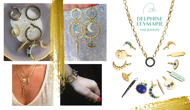
I mean, she added elegant gold accents in swooshes as if brushed on, now to be found throughout the website, lookbook, and even on my business card. It's the most wonderfully subtle hint of my daily handling of that very precious metal, and it communicates intuitively that the jewelry is hand carved, as if showing the maker's touch.
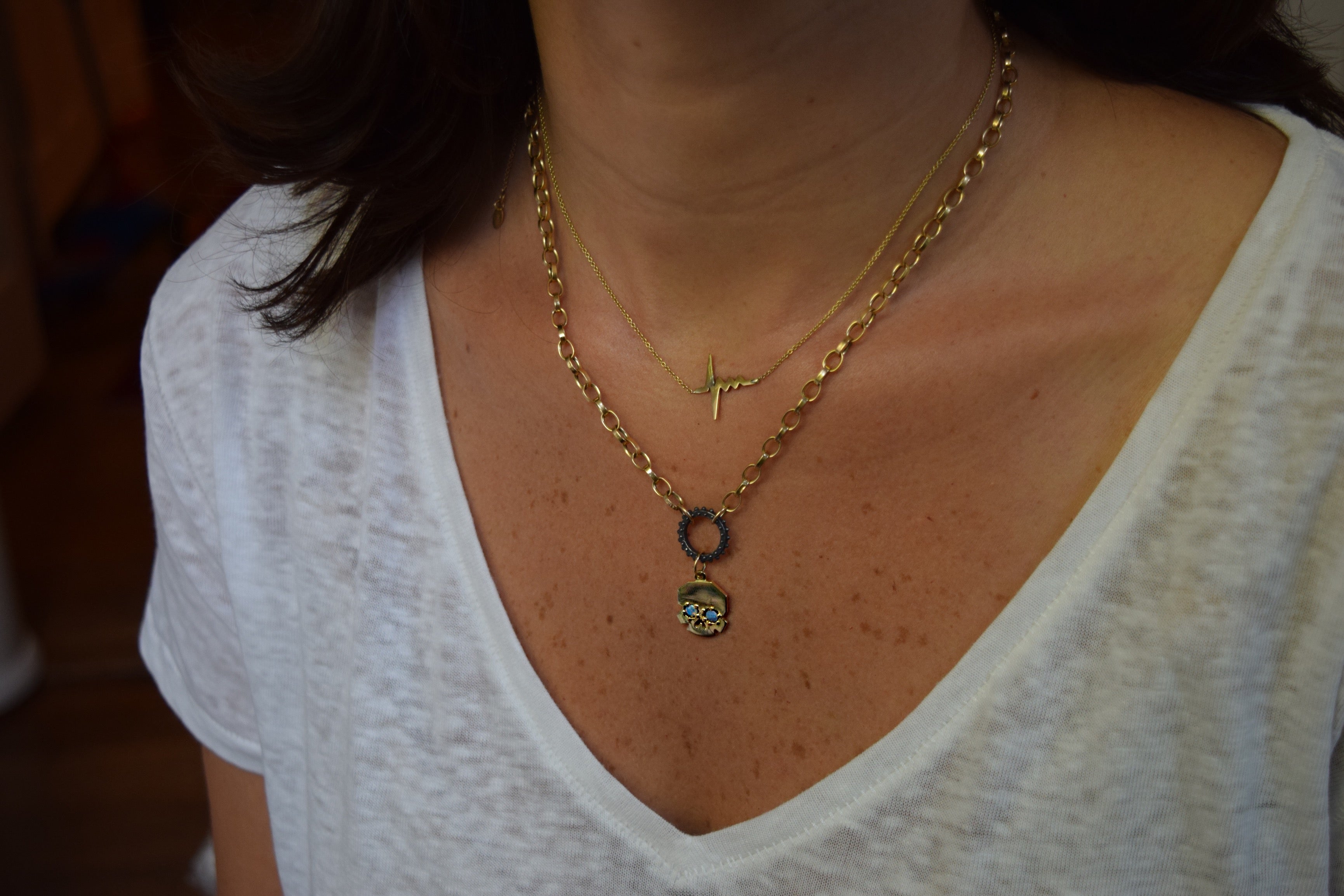
The brand colors have transitioned from a regal but cold deep purple and orange combination to this wonderful teal/peacock blue and warm sand pairing, reminiscent of many a shimmering seas and the beach, while also hinting at the fact that I strive to be "green" in my jewelry making practices, using recycled gold and ethically sourced gems as often as possible. And getting all that organic-ness counterbalanced by her clever use of black and white lifestyle pictures, bringing in this edgy city grit vibe that I love.
Tiphaine also decided we should keep my signature as it was part of the brand legacy, since it is how I have always stamped & signed my pieces, but make it a more prominent part of the branding by including it in the logo (love that!).
The result? Fresh, modern, accessible, mindful luxury in visual form.
But you don't have to take my word for it. Just scroll down for pictures of the new branded collateral materials or click HERE to check out the new web design. It makes me so happy when I open the new site now, and given your reactions so far, I think we can all agree that she did an amazing job.
So many "thank you" and "merci beaucoup", Tiphaine, for your always on-point expertise, wicked sense humor, superb style and kickass talent, and most of all, your priceless friendship!
Oh, and if you're ever in need for a branding expect too, you can find her here: https://www.tbranding.com
Bisous, lovers!
Delph
![]()


